Portraits

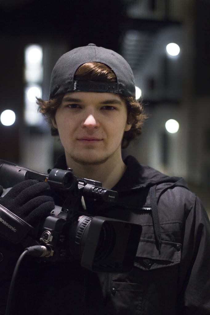
For the portraiture brief, i decided to take portraits of the members of the crew for a short film i am currently making for another university module. I wanted the Portraits to be natural and in the location we were filming in as i liked the lighting that already existed there.

In terms of my direction, i took inspiration from photographer Rineka Dijkstra’s portraits of children from different cultures on beaches in that i wanted to give the subjects little direction and let them either create their own pose or capture them in their most natural form.

Final Images:

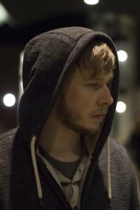
Oli

I liked the lighting in this image as the background almost frames the subjects face.

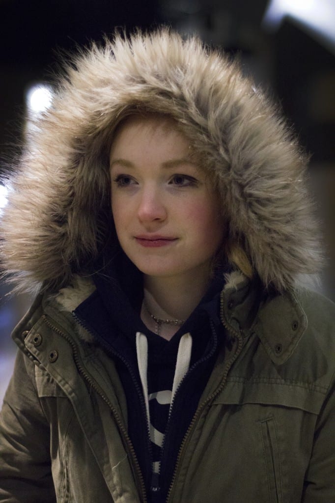
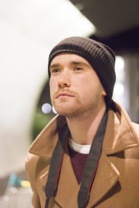
Ali


I liked the lighting in this image because its soft, which goes with the expression on Ali’s face and lights up the fur in her hood nicely.

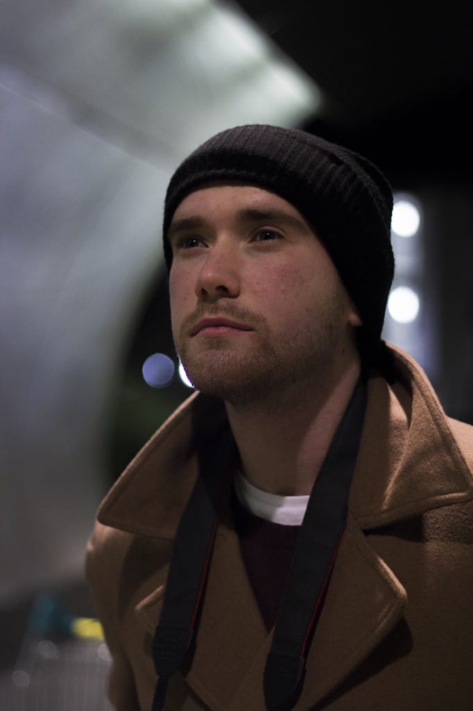
Andy


This was one  of the images where the subject chose their own pose without my direction. I chose to use this image as i liked the lighting on his face and in the background.

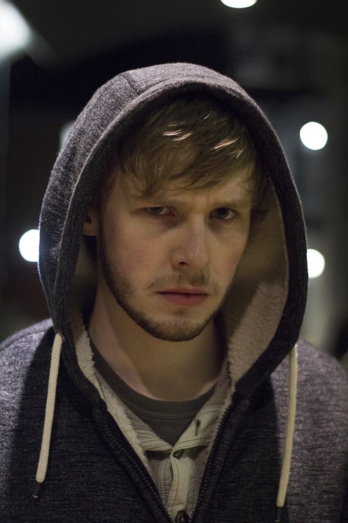
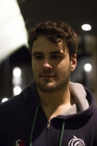
Harry

Once again, i liked this image because of the lighting on the subjects face and in the background.


Other images that i took during the shoot:

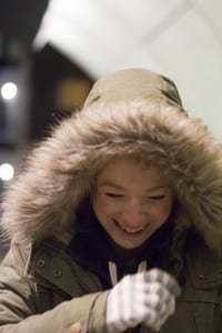
alay

I did like the idea of having an image of the subject in their natural state who is laughing, however the framing and lighting of this image was off so i chose to use the other image of Ali.

ANDAY


Although i did like the pose that Andy did for this image, i preferred the lighting and framing of the other one.

HARRYYYY


jose

I thought the lighting in both of these photos was off
Home

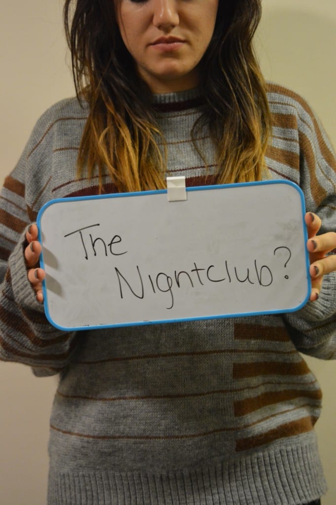
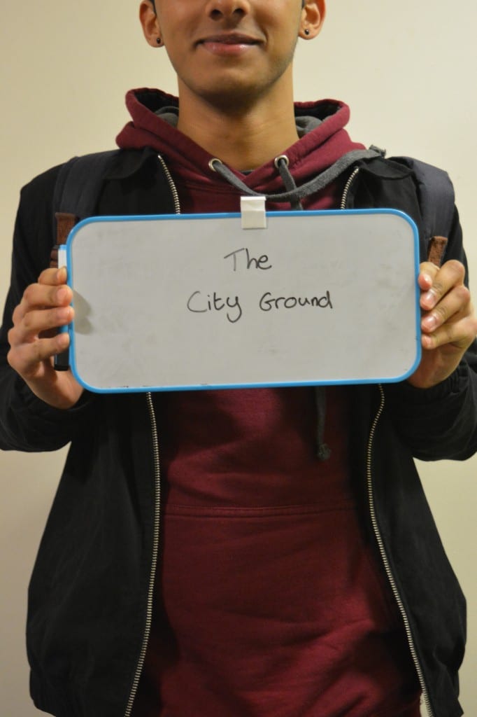
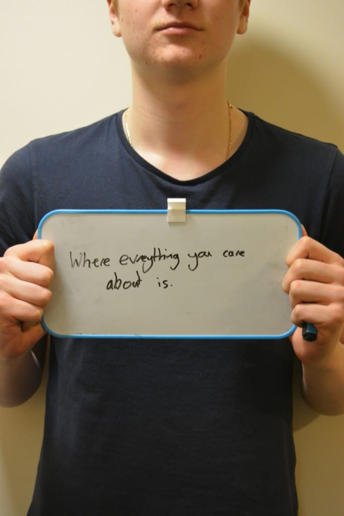
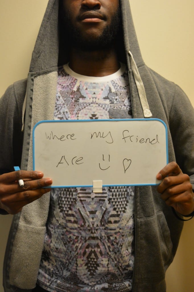
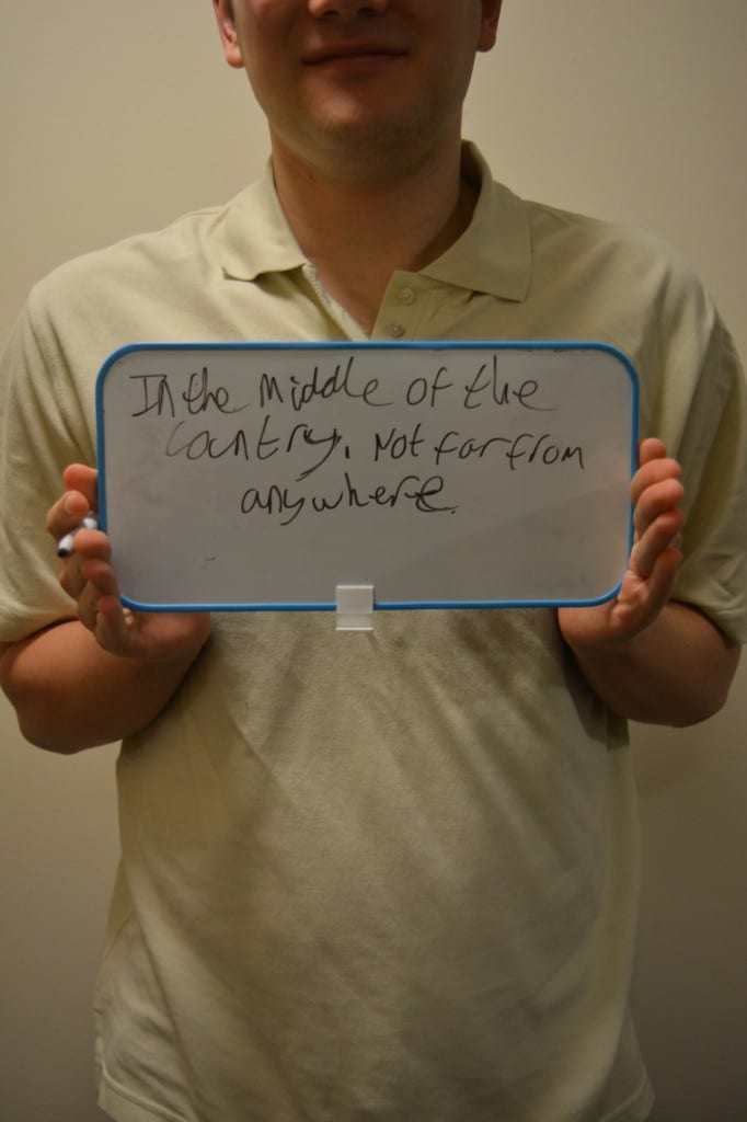
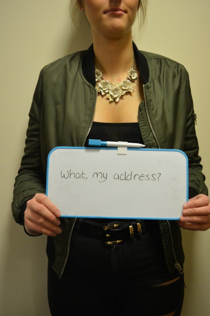
For this brief, we were asked to put our own interpretation on the word ‘Home’. I chose to talk to the subject about their home life and background and then asked the “where is home?” and got them to write their first response on a whiteboard and hold it up in front of them in the picture. I wanted to have a bit of anonymity so i left out the majority of the subjects face in the images.

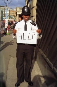
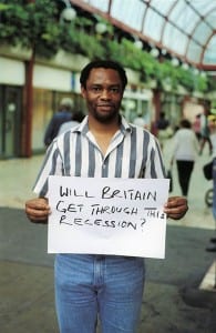
These images were similar by Gillian Wearing’s project on signs. She used signs as a way of letting the subject show their true feelings or inner thoughts, which is the same thing that i wanted to get by using text in my images.

GW_Image-01 wearing

My final images: 

DSC_0153
Talor, 18, Mansfield

Talor works as a club promoter for the Lincoln nightclub ‘Home’. When asked where home was, her first thought was not her family home, but the nightclub that she works at.


DSC_0156
Anil, 18, Nottingham

Anil goes back to Nottingham to watch Forrest play at The City Ground almost every weekend. Yet he hasn’t felt the need to visit his parents while he is there once since moving to Uni.

DSC_0157
Reuben, 19, Nottingham.

Reuben cares about his family and friends more than anything, but he has relatives and loved ones all over the world. To him, home is wherever the people most important to him are.

DSC_0160
Kasean, 19, London.

Living in London can be lonely due to is size and the masses of people, this is why, to Kasean, home is wherever his friends are and where he feels like he isn’t just another face in the crowd.

DSC_0161
Ashley, 19, Leicester

Ashley is quite a closed person in that he doesn’t open up about his emotions easily. This is reflected in his literal response to my question.

DSC_0164
Sian, 18, Doncaster.

Sian is known among her circle of friends for being one of the smartest in the group, but she tends to take things literally. So when asked where home was to her, she immediately assumed that i was asking her for her address.

Still Life

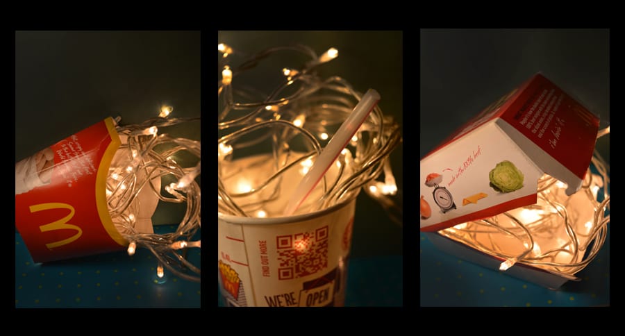
My second brief was to based around taking still life images of found objects, with my workshop tutor telling us which area on a map to find our objects from. I then had to take interesting images of the objets and create a triptych. I did this using Photoshop as its a software that i am more familiar with and more comfortable using in comparison to Lightroom.

I decided to use the packaging from McDonalds meals as my found objects and chose to make them more interesting through lighting. I used christmas/fairy lights in each of the objects to create a more interesting image.

I also tried to use different depths of field and have certain elements in focus (the straw) and having the lights slightly out of focus in each image.


The final image:

Triptych

Appropriation

For my first brief, i was asked to create some images that demonstrated appropriation. This involved taking already existing images or things and changing them to give them a new meaning. Photographers and artists who create appropriation art, such as Richard Prince have been known to cause controversy as this practice is based around ‘stealing’ someone else’s work and giving it a new meaning or context by changing it slightly (or drastically).


For this brief i created 3 final images:

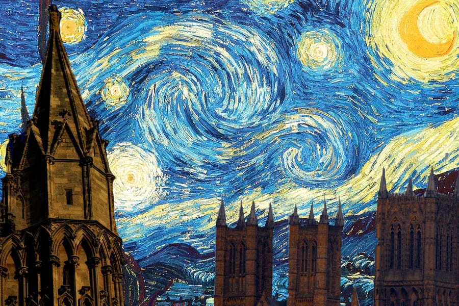
Starry Cathederal

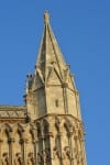
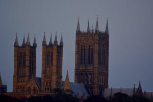
This first image that i created uses Van Gough’s ‘A Starry Night’ (which is one of my favourite pictures ever) but edited the image so that it showed Lincoln’s Cathedral rather than the original , silhouette of a church building. I was inspired to create this image by both the original painting and images that i had taken of the cathedral at night a few days previously, which reminded me of the building in the painting.

The images i took of the cathedral that were used in the final image:

DSC_0011DSC_0015

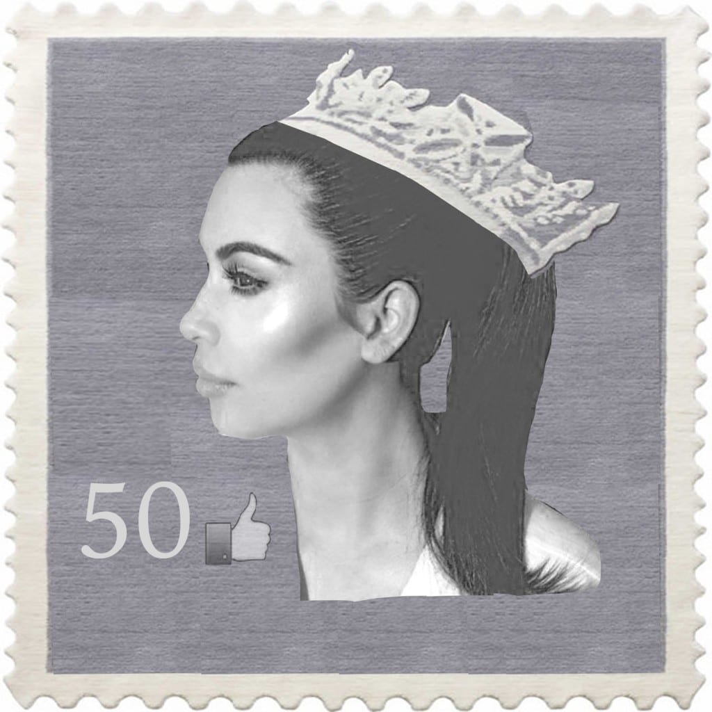
The wanted the second image that i created to have a deeper meaning behind it therefore i chose to create an image which reflected the changing dominance and influence of social media and celebrity in society as oppose to the previous dominance of more traditional powers (eg: the monarchy). I chose to show this by altering a British stamp, usually seen with an image of Queen Elizabeth on it, to a profile image of Kim Kardashian. I also changed the currency on the stamp to the ‘like’ image from facebook as a symbol of social media that is recognised by many.

The final image:

stampfinal


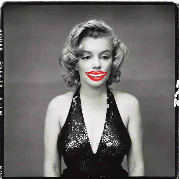
My third image was inspired by one of Richard Avedon’s last portraits of Marilyn Monroe. In the photo, she looks sad which is a contrast to how she was usually presented to the public, i therefore decided to use this portrait and change it so that it had a fake smile over her natural, unhappy expression.

Final Image:

maralyn